Visualization in Data Science & AI
Sachida Kumar
2:29:05
Description
Tutorials to design amazing charts for visualization and communication for Data Science, AI and Software Development
What You'll Learn?
- Visualization For Data Science
- Visualization From Basic To Advance
- Not Just Theory But Hands On Tutorial
- Learn To Choose and Design Appropriate Plot For Your Purpose
- Power BI From Basic To Advance
- Industry Relevant Skills
- Visualization In Python From Basic To Advance
- Learn To Create Compelling Graphs That Do Not Lie
Who is this for?
More details
DescriptionData visualization is an essential part of the data science project lifecycle. It is the process of placing data into a visual context like a map or graph to make it simpler for the human mind to understand and draw conclusions from it. Data visualization's major objective is to make it simpler to spot patterns, trends, and outliers in big data sets.
By the end of this course, learners are provided a high-level overview of data analysis and visualization tools and are prepared to discuss best practices and develop an ensuing action plan that addresses key discoveries. It begins with common hurdles that obstruct the adoption of a data-driven culture before introducing data analysis tools (R software, Minitab, MATLAB, and Python). A deeper examination is spent on statistical process control (SPC), which is a method for studying variation over time. The course also addresses the do’s and don’ts of presenting data visually, visualization software (Tableau, Excel, Power BI), and creating a data story.
The material features online lectures, videos, demos, project work, readings, and discussions. This course is ideal for individuals keen on developing a data-driven mindset that derives powerful insights useful for improving a company’s bottom line. It is helpful if learners have some familiarity with reading reports, gathering and using data, and interpreting visualizations. It is the second course in the Data-Driven Decision Making (DDDM) specialization.
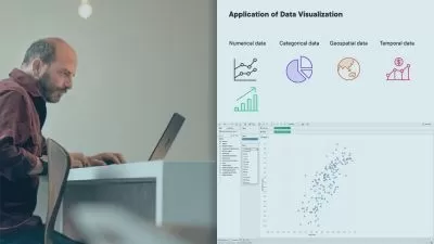
Multiple Business Intelligence Tools (BI) are currently ruling the market with each having its pros and cons. The concept of self-service dashboards was devised to allow stakeholders with little or no knowledge of data science, to work independently on data, and derive some findings that might assist their day-to-day business decisions. We will look at some of the applications of data visualization using Tableau or Python in the examples below.
Would you prefer to view large data tables and then make sense of that data or view a data visualization that represents that data in an easy-to-understand visual format? Well, most of you would prefer data visualization! And that is because data visualization is extremely useful in understanding the data and obtaining useful insights. It can allow you to get an instant understanding of the data that is just not possible by observing rows of data in a table. That’s what makes it so important in Data Science!
Data visualization forms the backbone of all analytical projects. It not only helps in gaining insights into the data but can be used as a tool for data pre-processing. Having the right set of visualizations for different data types and business scenarios is the key to effective communication of results.
Who this course is for:
- Data Scientists
- Beginners in Data Science & AI
- Programmers/Developers
- Researchers
- Communication Experts
- College Students
- Working Professionals
Data visualization is an essential part of the data science project lifecycle. It is the process of placing data into a visual context like a map or graph to make it simpler for the human mind to understand and draw conclusions from it. Data visualization's major objective is to make it simpler to spot patterns, trends, and outliers in big data sets.
By the end of this course, learners are provided a high-level overview of data analysis and visualization tools and are prepared to discuss best practices and develop an ensuing action plan that addresses key discoveries. It begins with common hurdles that obstruct the adoption of a data-driven culture before introducing data analysis tools (R software, Minitab, MATLAB, and Python). A deeper examination is spent on statistical process control (SPC), which is a method for studying variation over time. The course also addresses the do’s and don’ts of presenting data visually, visualization software (Tableau, Excel, Power BI), and creating a data story.
The material features online lectures, videos, demos, project work, readings, and discussions. This course is ideal for individuals keen on developing a data-driven mindset that derives powerful insights useful for improving a company’s bottom line. It is helpful if learners have some familiarity with reading reports, gathering and using data, and interpreting visualizations. It is the second course in the Data-Driven Decision Making (DDDM) specialization.
Multiple Business Intelligence Tools (BI) are currently ruling the market with each having its pros and cons. The concept of self-service dashboards was devised to allow stakeholders with little or no knowledge of data science, to work independently on data, and derive some findings that might assist their day-to-day business decisions. We will look at some of the applications of data visualization using Tableau or Python in the examples below.
Would you prefer to view large data tables and then make sense of that data or view a data visualization that represents that data in an easy-to-understand visual format? Well, most of you would prefer data visualization! And that is because data visualization is extremely useful in understanding the data and obtaining useful insights. It can allow you to get an instant understanding of the data that is just not possible by observing rows of data in a table. That’s what makes it so important in Data Science!
Data visualization forms the backbone of all analytical projects. It not only helps in gaining insights into the data but can be used as a tool for data pre-processing. Having the right set of visualizations for different data types and business scenarios is the key to effective communication of results.
Who this course is for:
- Data Scientists
- Beginners in Data Science & AI
- Programmers/Developers
- Researchers
- Communication Experts
- College Students
- Working Professionals
User Reviews
Rating

Sachida Kumar
Instructor's Courses
Udemy
View courses Udemy- language english
- Training sessions 12
- duration 2:29:05
- Release Date 2022/12/11