Python Data Visualization: Dashboards with Plotly & Dash
Maven Analytics,Chris Bruehl
8:31:17
Description
Create custom Python visuals, interactive dashboards and web apps using Plotly & Dash, with unique, real-world projects
What You'll Learn?
- Master the essentials of Plotly & Dash for building interactive visuals, dashboards and web apps
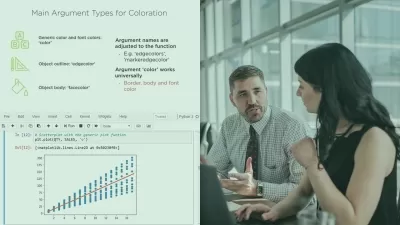
- Design and format Plotly visuals, including line charts, bar charts, scatter plots, histograms, maps and more
- Learn how to add interactive elements like dropdown menus, checklists, sliders and date pickers
- Apply HTML and markdown components to design custom dashboard layouts and themes
- Practice building and deploying your own custom web applications with Dash
- Explore advanced topics like conditional and chained callbacks, cross-filtering and real-time automation
Who is this for?
More details
DescriptionThis is a hands-on, project-based course designed to help you master Plotly and Dash, two of Python's most popular packages for creating interactive visuals, dashboards and web applications.
We'll start by introducing the core components of a Dash application, review basic front-end and back-end elements, and demonstrate how to tie everything together to create a simple, interactive web app.
From there we'll explore a variety of Plotly visuals including line charts, scatterplots, histograms and maps. We'll apply basic formatting options like layouts and axis labels, add context to our visuals using annotations and reference lines, then bring our data to life with interactive elements like dropdown menus, checklists, sliders, date pickers, and more.
Last but not least we'll use Dash to build and customize a web-based dashboard, using tools like markdown, HTML components & styles, themes, grids, tabs, and more. We'll also introduce some advanced topics like data tables, conditional and chained callbacks, cross-filters, and app deployment options.
Throughout the course you'll play the role of a Data Analyst for Maveluxe Travel, a high-end agency that helps customers find flights and resorts based on their travel preferences. Your task? Use Python to create interactive visuals and dashboards to help Maveluxe's travel agents best support their customers.
COURSEÂ OUTLINE:
Intro to Plotly &Â Dash
Introduce the Plotly & Dash libraries, and cover the key steps and components for creating a basic Dash application with interactive Plotly visuals
Plotly Figures &Â Chart Types
Dive into the Plotly library and use it to build and customize several chart types, including line charts, bar charts, pie charts, scatterplots, maps and histograms
Interactive Elements
Get comfortable embedding Dash’s interactive elements into your application, and using them to manipulate Plotly Visualizations
MID-COURSEÂ PROJECT
Build two working Dash applications to help the Maveluxe team visualize and explore data from ski resorts across the USÂ and Canada
Dashboard Layouts
Learn how to organize your visualizations and interactive components into a visually appealing and logical structure
Advanced Functionality
Take your applications to the next level by learning how to update your application with real-time data, develop chained-callback functions, and more!
FINALÂ PROJECT
Build a multi-tab dashboard to expand your mid-course project to ski resorts around the world, leveraging grid layouts, interactive elements and visuals, and advanced callback functions
Join today and get immediate, lifetime access to the following:
8.5 hours of high-quality video
Plotly &Â Dash PDF ebook (180+Â pages)
Downloadable project files &Â solutions
Expert support and Q&AÂ forum
30-day Udemy satisfaction guarantee
If you're a data scientist, analyst or business intelligence professional looking to add Plotly & Dash to your Python skill set, this is the course for you!
Happy learning!
-Chris Bruehl (Python Expert &Â Lead Python Instructor, Maven Analytics)
Who this course is for:
- Analysts or Data Scientists who want to build interactive visuals, dashboards or web apps
- Aspiring data scientists who want to build or strengthen their Python data visualization skills
- Anyone interested in learning one of the most popular open source programming languages in the world
- Students looking to learn powerful, practical skills with unique, hands-on projects and course demos
This is a hands-on, project-based course designed to help you master Plotly and Dash, two of Python's most popular packages for creating interactive visuals, dashboards and web applications.
We'll start by introducing the core components of a Dash application, review basic front-end and back-end elements, and demonstrate how to tie everything together to create a simple, interactive web app.
From there we'll explore a variety of Plotly visuals including line charts, scatterplots, histograms and maps. We'll apply basic formatting options like layouts and axis labels, add context to our visuals using annotations and reference lines, then bring our data to life with interactive elements like dropdown menus, checklists, sliders, date pickers, and more.
Last but not least we'll use Dash to build and customize a web-based dashboard, using tools like markdown, HTML components & styles, themes, grids, tabs, and more. We'll also introduce some advanced topics like data tables, conditional and chained callbacks, cross-filters, and app deployment options.
Throughout the course you'll play the role of a Data Analyst for Maveluxe Travel, a high-end agency that helps customers find flights and resorts based on their travel preferences. Your task? Use Python to create interactive visuals and dashboards to help Maveluxe's travel agents best support their customers.
COURSEÂ OUTLINE:
Intro to Plotly &Â Dash
Introduce the Plotly & Dash libraries, and cover the key steps and components for creating a basic Dash application with interactive Plotly visuals
Plotly Figures &Â Chart Types
Dive into the Plotly library and use it to build and customize several chart types, including line charts, bar charts, pie charts, scatterplots, maps and histograms
Interactive Elements
Get comfortable embedding Dash’s interactive elements into your application, and using them to manipulate Plotly Visualizations
MID-COURSEÂ PROJECT
Build two working Dash applications to help the Maveluxe team visualize and explore data from ski resorts across the USÂ and Canada
Dashboard Layouts
Learn how to organize your visualizations and interactive components into a visually appealing and logical structure
Advanced Functionality
Take your applications to the next level by learning how to update your application with real-time data, develop chained-callback functions, and more!
FINALÂ PROJECT
Build a multi-tab dashboard to expand your mid-course project to ski resorts around the world, leveraging grid layouts, interactive elements and visuals, and advanced callback functions
Join today and get immediate, lifetime access to the following:
8.5 hours of high-quality video
Plotly &Â Dash PDF ebook (180+Â pages)
Downloadable project files &Â solutions
Expert support and Q&AÂ forum
30-day Udemy satisfaction guarantee
If you're a data scientist, analyst or business intelligence professional looking to add Plotly & Dash to your Python skill set, this is the course for you!
Happy learning!
-Chris Bruehl (Python Expert &Â Lead Python Instructor, Maven Analytics)
Who this course is for:
- Analysts or Data Scientists who want to build interactive visuals, dashboards or web apps
- Aspiring data scientists who want to build or strengthen their Python data visualization skills
- Anyone interested in learning one of the most popular open source programming languages in the world
- Students looking to learn powerful, practical skills with unique, hands-on projects and course demos
User Reviews
Rating

Maven Analytics
Instructor's Courses
Chris Bruehl
Instructor's Courses
Udemy
View courses Udemy- language english
- Training sessions 110
- duration 8:31:17
- Release Date 2023/04/11