Matplotlib, Seaborn, and Plotly Python Libraries Beginners
Simon Sez IT
1:09:46
Description
Master data visualization in Python with Matplotlib, Seaborn, and Plotly libraries for effective data storytelling.
What You'll Learn?
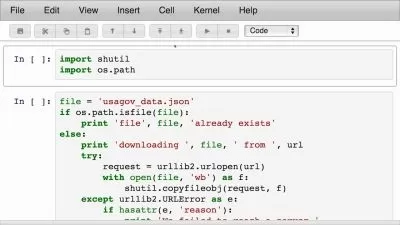
- Prepare data for visualization using Matplotlib.
- Create customized line charts with Matplotlib.
- Generate multiple line charts for comparative analysis.
- Construct bar charts to represent categorical data.
- Develop scatter plots to explore relationships between variables.
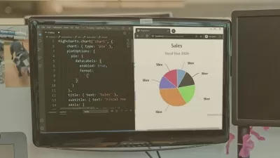
- Utilize Seaborn and Plotly libraries for diverse chart types.
Who is this for?
What You Need to Know?
More details
Description**This course includes downloadable instructor and exercise files to work with and follow along.
In this Matplotlib, Seaborn, and Plotly Python Libraries for Beginners course, you'll embark on a journey to master three essential tools for data visualization in Python.
You'll start by learning Matplotlib, where you'll discover how to prepare your data and create various charts like line charts, bar charts, and scatter plots. Next, delve into Seaborn to refine your visualization skills with advanced chart techniques. Then, explore Plotly to create interactive and visually appealing charts that enhance your data storytelling capabilities.
Throughout the course, you'll engage in hands-on exercises to reinforce your understanding of each library. Whether you're a beginner or looking to enhance your Python proficiency, this course provides the essential tools to excel in data visualization tasks.
By the end of this course, you should be able to confidently navigate Matplotlib, Seaborn, and Plotly, equipped with the skills to transform raw data into compelling visuals. Gain proficiency in three powerful Python libraries, enhancing your data analysis skills and improving your ability to communicate insights effectively.
By the end of this course, you will be able to:
Prepare data for visualization using Matplotlib.
Create customized line charts with Matplotlib.
Generate multiple line charts for comparative analysis.
Construct bar charts to represent categorical data.
Develop scatter plots to explore relationships between variables.
Utilize Seaborn and Plotly libraries for diverse chart types.
This course includes:
1+ hours of video tutorials
22 individual video lectures
Course and exercise files to follow along
Certificate of completion
Who this course is for:
- Beginner Python developer.
- Business and data analysts.
- Those who want to learn and use Matplotlib, Seaborn, and Plotly libraries for Python.
- Professionals aiming to enhance their skills in data visualization.
**This course includes downloadable instructor and exercise files to work with and follow along.
In this Matplotlib, Seaborn, and Plotly Python Libraries for Beginners course, you'll embark on a journey to master three essential tools for data visualization in Python.
You'll start by learning Matplotlib, where you'll discover how to prepare your data and create various charts like line charts, bar charts, and scatter plots. Next, delve into Seaborn to refine your visualization skills with advanced chart techniques. Then, explore Plotly to create interactive and visually appealing charts that enhance your data storytelling capabilities.
Throughout the course, you'll engage in hands-on exercises to reinforce your understanding of each library. Whether you're a beginner or looking to enhance your Python proficiency, this course provides the essential tools to excel in data visualization tasks.
By the end of this course, you should be able to confidently navigate Matplotlib, Seaborn, and Plotly, equipped with the skills to transform raw data into compelling visuals. Gain proficiency in three powerful Python libraries, enhancing your data analysis skills and improving your ability to communicate insights effectively.
By the end of this course, you will be able to:
Prepare data for visualization using Matplotlib.
Create customized line charts with Matplotlib.
Generate multiple line charts for comparative analysis.
Construct bar charts to represent categorical data.
Develop scatter plots to explore relationships between variables.
Utilize Seaborn and Plotly libraries for diverse chart types.
This course includes:
1+ hours of video tutorials
22 individual video lectures
Course and exercise files to follow along
Certificate of completion
Who this course is for:
- Beginner Python developer.
- Business and data analysts.
- Those who want to learn and use Matplotlib, Seaborn, and Plotly libraries for Python.
- Professionals aiming to enhance their skills in data visualization.
User Reviews
Rating

Simon Sez IT
Instructor's Courses
Udemy
View courses Udemy- language english
- Training sessions 23
- duration 1:09:46
- Release Date 2024/07/23