Executive Program in Data Visualization
Nitin Kr Saxena PhD
3:21:07
Description
A Storytelling Approach
What You'll Learn?
- Learn the techniques to communicate a clear and concise message in just 10 second
- Learn how to create different chart and graph types in Excel
- Learn the art of presenting data in a storytelling way
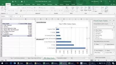
- Learn Pivot charts and make live charts
- Master the art of creating impactful dashboards
Who is this for?
What You Need to Know?
More details
DescriptionIn an age driven by "big data", we need to cut through the noise and present key information in a way that can be quickly consumed and acted upon making data visualization an increasingly important skill.
Visualizations need to not only present data in an easy-to-understand and attractive way, but they must also provide context for the data, tell a story, achieving that fine balance between form and function.
Excel has many rivals in this space, but it is still an excellent choice, particularly if it's where your data resides. It offers a wealth of tools for creating visualizations other than charts and the chart options available are constantly increasing and improving, so the newer versions now include waterfall charts, sunburst diagrams, and even map charts.
But what sets Excel apart is its flexibility, it gives us total creative control over our designs so if needed we could produce our own animated custom chart to tell the right story for our data.
In this course, we will explore Excel's rich selection of visualization tools using practical case studies. The course deals with visualizations that will show trends, forecasts, breakdowns, and comparisons for a large variety of data sets.
The course covers the usual chart types like conditional formats, sparklines, and specialized charts and even creates animated charts and infographics, along with dashboards
In some cases, pivot tables are required to drill down and answer very specific questions. The course includes a bonus section on the pivot table.
You will also be learning to present your finished visualizations in attractive reports and dashboards that use tools like slicers and macros for automation and interactivity.
Who this course is for:
- The course is design for Young Managers who require a convincing story telling to support their work.
- The course is beneficial for Students, Research Scholars, Summer Interns who have to present their data and survey response in a presentable manner along with impact
- Anyone looking to master data visualization with a 360-degree approach
- Excel using who have a basic skills but want to master advanced charts, graphs & dashboards
- Aspirants aiming to exploit data visualization techniques to successfully show their achievements to the management.
- Anyone looking to pursue career in data analytics & business intelligence
In an age driven by "big data", we need to cut through the noise and present key information in a way that can be quickly consumed and acted upon making data visualization an increasingly important skill.
Visualizations need to not only present data in an easy-to-understand and attractive way, but they must also provide context for the data, tell a story, achieving that fine balance between form and function.
Excel has many rivals in this space, but it is still an excellent choice, particularly if it's where your data resides. It offers a wealth of tools for creating visualizations other than charts and the chart options available are constantly increasing and improving, so the newer versions now include waterfall charts, sunburst diagrams, and even map charts.
But what sets Excel apart is its flexibility, it gives us total creative control over our designs so if needed we could produce our own animated custom chart to tell the right story for our data.
In this course, we will explore Excel's rich selection of visualization tools using practical case studies. The course deals with visualizations that will show trends, forecasts, breakdowns, and comparisons for a large variety of data sets.
The course covers the usual chart types like conditional formats, sparklines, and specialized charts and even creates animated charts and infographics, along with dashboards
In some cases, pivot tables are required to drill down and answer very specific questions. The course includes a bonus section on the pivot table.
You will also be learning to present your finished visualizations in attractive reports and dashboards that use tools like slicers and macros for automation and interactivity.
Who this course is for:
- The course is design for Young Managers who require a convincing story telling to support their work.
- The course is beneficial for Students, Research Scholars, Summer Interns who have to present their data and survey response in a presentable manner along with impact
- Anyone looking to master data visualization with a 360-degree approach
- Excel using who have a basic skills but want to master advanced charts, graphs & dashboards
- Aspirants aiming to exploit data visualization techniques to successfully show their achievements to the management.
- Anyone looking to pursue career in data analytics & business intelligence
User Reviews
Rating

Nitin Kr Saxena PhD
Instructor's Courses
Udemy
View courses Udemy- language english
- Training sessions 50
- duration 3:21:07
- Release Date 2024/04/13