Data Science and Analytics with AWS Quicksight and Power BI
Harshit Srivastava
2:00:55
Description
Learn to create Power BI Visualization Charts and Reports | Data Preparation | Finding Insights from Data in Quicksight
What You'll Learn?
- You would be able to create various kinds of Visualization charts using AWS Quicksight
- You could create charts such as Pie, Bar, Treemap and Pivot table
- You could visually find insights from the dataset and perform analysis to find useful information
- You could create Filters and Calculated fields to perform data cleaning and preparation
- You will learn to create various Visualization charts in Microsoft Power BI
- You will be able to create various charts such as Bar, Pie, Line, Ring, Donut, Ribbon, Treemap charts
- You will learn to create Table and Matrix and perform various operations on charts
Who is this for?
More details
DescriptionData Science has been one of the most demanded skillset that has been well reputed in this Internet age. Every moment, we are creating raw data by all our digital activities- from searching to streaming, shopping to learning and everything else. Not just humans, but street cameras, animals, IoT devices and countless other sources are also contributing to this massive pile of information. As someone said it correctly- Data is the new Oil. In order to find meaningful insights from a dataset that can drive business decisions and other actions we need certain tools and techniques where we can perform various operations on the dataset.
Microsoft Power BI is one of the popular tool that can be used to perform wide range of operations on a dataset. It can be used for creating some amazing Visualization charts and BI report that can be used to find critical insights from the dataset. In this course, you will learn to create a variety of visual charts and ways to customize them. You will learn to create-
Bar, Line and Pie charts
Donut or Ring chart
Drill down and Analysis of charts using Treemap
Table and Matrix
Ribbon and Waterfall charts
After you have learned Power BI, you can perform various operations on the similar dataset on the Cloud computing platforms such as AWS (Amazon Web Services) using AWS Quicksight Business Intelligence and Data Analysis tool. You will learn about Data Preparations, Data Cleaning, Data Visualization and Data Analysis-
In Data Preparation, you will learn to-
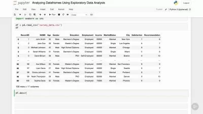
Edit Dataset before creating charts or Data Cleaning by removing unwanted fields or rows from the dataset
Create Calculated fields for custom columns
Using filters to aggregate fields based on certain criteria and Using Excluded lists to discard certain columns
After that you will learn to create some visualization charts and analyze them such as-
Basic charts such as bar, treemap
Pivot table
Map chart and conditional formatting
Who this course is for:
- Anyone who is curious to learn Data Science on AWS cloud computing platform using Quicksight
- Anyone interested in Data Analysis and Business Intelligence
- Curious to learn Data Visualization and creating various data analytics charts and reports
- Someone looking to learn Microsoft Power BI
Data Science has been one of the most demanded skillset that has been well reputed in this Internet age. Every moment, we are creating raw data by all our digital activities- from searching to streaming, shopping to learning and everything else. Not just humans, but street cameras, animals, IoT devices and countless other sources are also contributing to this massive pile of information. As someone said it correctly- Data is the new Oil. In order to find meaningful insights from a dataset that can drive business decisions and other actions we need certain tools and techniques where we can perform various operations on the dataset.
Microsoft Power BI is one of the popular tool that can be used to perform wide range of operations on a dataset. It can be used for creating some amazing Visualization charts and BI report that can be used to find critical insights from the dataset. In this course, you will learn to create a variety of visual charts and ways to customize them. You will learn to create-
Bar, Line and Pie charts
Donut or Ring chart
Drill down and Analysis of charts using Treemap
Table and Matrix
Ribbon and Waterfall charts
After you have learned Power BI, you can perform various operations on the similar dataset on the Cloud computing platforms such as AWS (Amazon Web Services) using AWS Quicksight Business Intelligence and Data Analysis tool. You will learn about Data Preparations, Data Cleaning, Data Visualization and Data Analysis-
In Data Preparation, you will learn to-
Edit Dataset before creating charts or Data Cleaning by removing unwanted fields or rows from the dataset
Create Calculated fields for custom columns
Using filters to aggregate fields based on certain criteria and Using Excluded lists to discard certain columns
After that you will learn to create some visualization charts and analyze them such as-
Basic charts such as bar, treemap
Pivot table
Map chart and conditional formatting
Who this course is for:
- Anyone who is curious to learn Data Science on AWS cloud computing platform using Quicksight
- Anyone interested in Data Analysis and Business Intelligence
- Curious to learn Data Visualization and creating various data analytics charts and reports
- Someone looking to learn Microsoft Power BI
User Reviews
Rating

Harshit Srivastava
Instructor's Courses
Udemy
View courses Udemy- language english
- Training sessions 23
- duration 2:00:55
- Release Date 2023/02/12