2023 Data Analysis & Visualization in python Masterclass
Jobshie Academy
12:47:11
Description
Build your Data Analysis and Visualization skills with Python, Excel and Looker | Bring your data to LIFE
What You'll Learn?
- Build powerful, practical skills for modern analytics and business intelligence
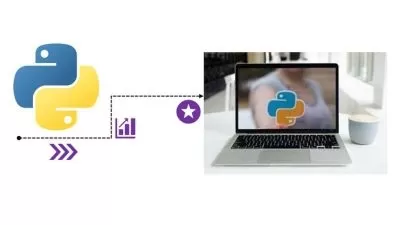
- Be able to use Python for data science and machine learning
- You will be able to use Python for your own work problems or personal projects.
- Learn to use Object Oriented Programming with classes!
- Master Microsoft Excel from Beginner to Advanced
- Build a solid understanding on the Basics of Microsoft Excel
- Maintain large sets of Excel data in a list or table
- All the Chart Types in Looker like Bar, Time Series, Geo Maps, Scatter Plots etc and how to configure each of them
- Learn how to use Looker to create Interactive and Beautiful Dashboards
- Learn everything there is to know about pandas - from absolute scratch!
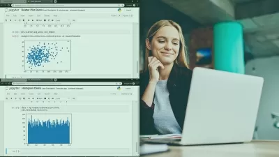
- Create beautiful visualizations with Seaborn
Who is this for?
More details
Description***** Enrol now in the most comprehensive and up-to-date (Nov 2022) course available for the Data Analysis & Visualization in python Concepts! *****
About the Instructor.
This course is led by Aditya Dhandi - an international trainer, consultant, and data analyst with over 100 000 enrollments on Udemy. Aditya specializes in teaching data analysis techniques, Excel Pivot Tables, Power Pivot, Microsoft Power BI, & Google Data Studio & his courses average 4+ stars out of 5.
He's also the founder of the popular website, Jobshie.
Why Learn Data Analysis & Visualization?
Data analysis is a process of inspecting, cleansing, transforming, and modeling data with the goal of discovering useful information, informing conclusions, and supporting decision-making.
Data analysis has multiple facets and approaches, encompassing diverse techniques under a variety of names, and is used in different business, science, and social science domains.
This course is a complete package for everyone wanting to pursue a career in data analysis.
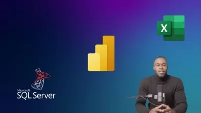
This course gives you complete knowledge from basics to advanced level on Excel, Python, and SQL.
You will learn to create interactive dashboards using Excel as well as Looker.
Key Features:
Video Lectures: Learn the best ways to learn Data Analysis & Visualization
Course Certificate: Complete the course and show off your skills with the course certificate.
Learn from experts: Your expert instructor will teach you Data Analysis & Visualization skills you can apply immediately.
Full Excess: There is no time limit, so take the course at your own pace and retake lessons as you need.
Use any Device: Join the course using any modern browser on your phone, tablet and computer.
Ask Question: Ask questions and share ideas with other students in the course community.
What's included?
High quality video lessons to build your knowledge and skills.
Guided walk-throughs with techniques and tips.
14 pre-built dashboards you can use and customize.
Practical exercises to apply your skills.
Quizzes to reinforce learnings and test your knowledge.
Private discussion area where you can ask questions.
Course certificate for completing the lessons and assignment.
Full access lets you review lessons whenever you need.
Updates when lessons in the course are refreshed.
Jobshie Academy Reviews
300+ learner reviews | 4+ average rating
We help learners across the globe develop new skills and achieve their personal and professional goals. Browse learner reviews below to discover how people enjoy the online learning experience at Jobshie Academy.
"I have gained useful skills while learning this course. I can consider myself a data analysis specialist. Thank you"
by Joseph Israel
"I was a nice experience about this course as it introduces with many topics which are related to data analysis ."
by Sreeraj Mopkar
"very good explaination , bohot achhe se sab samajh aata hai ...100% Understanding all concept very much....excellent explanation"
by Moosa Khan
"The course is very instructive and didactic, I liked it, it is all the information I need for my activities"
by Jaime Ronald Palma Aguilar
"yeah it was such a great course, the teacher took time out to disect all angles of Excel, he touched all the essential parts, needed for our daily use of excel. Thanks a lot"
by Unyime Joshua
"The instructor is very knowledgeable and teach in a very engaging way. I totally recommend this course.????"
by Aditya
FAQs
When does the Data Analysis & Visualization course start and finish?
The course starts as soon as you join! It is a completely self-paced online course, so you decide when you start and when you finish.
How long does it take to complete the course?
We recommend taking the course over two to three weeks, so you have time to apply the lessons to your account (or your client’s account). That being said we've seen people complete the course in a week and others that spread the lessons over a couple of months.
How long do I have access to the Data Analysis & Visualization course?
You receive full access to the course so that you can take the lessons at any time. You can rewatch lessons whenever you like and any lesson updates are included.
Will I receive a certificate?
Yes, once you complete all of the lessons, exercises, quizzes, and course assignment, you'll receive your course certificate.
What are you waiting for?
There’s never been a better time to add a skill like programming to your toolbox and Data Analysis & Visualization to get started. So check out the free preview and get enrolled! You've got nothing to lose and everything to gain!
Who this course is for:
- Data Scientists, Data Analysts.
- Students and professionals who wants to do data analysis using python.
- Students and professionals who have tried machine learning and data science but are having trouble putting the ideas down in code
- Python developer who wants to do analysis of tabular data.
- Who Is curious about how to build effective and impactful graphsnts to start their data visualization journey
- Anyone who want to express thoughts, findings, insights from any kind of data using data Visualization.
***** Enrol now in the most comprehensive and up-to-date (Nov 2022) course available for the Data Analysis & Visualization in python Concepts! *****
About the Instructor.
This course is led by Aditya Dhandi - an international trainer, consultant, and data analyst with over 100 000 enrollments on Udemy. Aditya specializes in teaching data analysis techniques, Excel Pivot Tables, Power Pivot, Microsoft Power BI, & Google Data Studio & his courses average 4+ stars out of 5.
He's also the founder of the popular website, Jobshie.
Why Learn Data Analysis & Visualization?
Data analysis is a process of inspecting, cleansing, transforming, and modeling data with the goal of discovering useful information, informing conclusions, and supporting decision-making.
Data analysis has multiple facets and approaches, encompassing diverse techniques under a variety of names, and is used in different business, science, and social science domains.
This course is a complete package for everyone wanting to pursue a career in data analysis.
This course gives you complete knowledge from basics to advanced level on Excel, Python, and SQL.
You will learn to create interactive dashboards using Excel as well as Looker.
Key Features:
Video Lectures: Learn the best ways to learn Data Analysis & Visualization
Course Certificate: Complete the course and show off your skills with the course certificate.
Learn from experts: Your expert instructor will teach you Data Analysis & Visualization skills you can apply immediately.
Full Excess: There is no time limit, so take the course at your own pace and retake lessons as you need.
Use any Device: Join the course using any modern browser on your phone, tablet and computer.
Ask Question: Ask questions and share ideas with other students in the course community.
What's included?
High quality video lessons to build your knowledge and skills.
Guided walk-throughs with techniques and tips.
14 pre-built dashboards you can use and customize.
Practical exercises to apply your skills.
Quizzes to reinforce learnings and test your knowledge.
Private discussion area where you can ask questions.
Course certificate for completing the lessons and assignment.
Full access lets you review lessons whenever you need.
Updates when lessons in the course are refreshed.
Jobshie Academy Reviews
300+ learner reviews | 4+ average rating
We help learners across the globe develop new skills and achieve their personal and professional goals. Browse learner reviews below to discover how people enjoy the online learning experience at Jobshie Academy.
"I have gained useful skills while learning this course. I can consider myself a data analysis specialist. Thank you"
by Joseph Israel
"I was a nice experience about this course as it introduces with many topics which are related to data analysis ."
by Sreeraj Mopkar
"very good explaination , bohot achhe se sab samajh aata hai ...100% Understanding all concept very much....excellent explanation"
by Moosa Khan
"The course is very instructive and didactic, I liked it, it is all the information I need for my activities"
by Jaime Ronald Palma Aguilar
"yeah it was such a great course, the teacher took time out to disect all angles of Excel, he touched all the essential parts, needed for our daily use of excel. Thanks a lot"
by Unyime Joshua
"The instructor is very knowledgeable and teach in a very engaging way. I totally recommend this course.????"
by Aditya
FAQs
When does the Data Analysis & Visualization course start and finish?
The course starts as soon as you join! It is a completely self-paced online course, so you decide when you start and when you finish.
How long does it take to complete the course?
We recommend taking the course over two to three weeks, so you have time to apply the lessons to your account (or your client’s account). That being said we've seen people complete the course in a week and others that spread the lessons over a couple of months.
How long do I have access to the Data Analysis & Visualization course?
You receive full access to the course so that you can take the lessons at any time. You can rewatch lessons whenever you like and any lesson updates are included.
Will I receive a certificate?
Yes, once you complete all of the lessons, exercises, quizzes, and course assignment, you'll receive your course certificate.
What are you waiting for?
There’s never been a better time to add a skill like programming to your toolbox and Data Analysis & Visualization to get started. So check out the free preview and get enrolled! You've got nothing to lose and everything to gain!
Who this course is for:
- Data Scientists, Data Analysts.
- Students and professionals who wants to do data analysis using python.
- Students and professionals who have tried machine learning and data science but are having trouble putting the ideas down in code
- Python developer who wants to do analysis of tabular data.
- Who Is curious about how to build effective and impactful graphsnts to start their data visualization journey
- Anyone who want to express thoughts, findings, insights from any kind of data using data Visualization.
User Reviews
Rating

Jobshie Academy
Instructor's Courses
Udemy
View courses Udemy- language english
- Training sessions 147
- duration 12:47:11
- Release Date 2023/02/06