
Responsive Layouts
Focused View
Nick Pettit
30:00
227 View
01. Course Overview.webm
01:29
02. What is Responsive Web Design.webm
01:27
03. Thinking in Relative Units.webm
02:12
responsive-layouts-base-template.zip
01. Media Query Review.webm
07:17
02. Understanding Breakpoints.webm
02:53
03. Creating Breakpoints.webm
03:49
responsive-layouts-base-template.zip
01. Responsive Design Patterns.webm
02:32
02. Flexbox.webm
08:21
responsive-layouts-base-template.zip
responsive-layouts-flexbox-example.zip
Description
About this Course
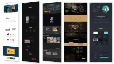
Responsive web design is a collection of techniques for building websites that work on multiple screen sizes. In these lessons, we're going to use the foundational principles of responsive design as a framework for thinking about page layout. By the end, you should have a better understanding of how to approach common decisions in responsive design.
What you'll learn
- Responsive design theory
- Media queries
- Breakpoints
- Page layout
More details
User Reviews
Rating
average 0
Focused display
Category

Nick Pettit
Instructor's CoursesNick is a teacher at Treehouse and an independent game developer. His Twitter handle is @nickrp.

Treehouse
View courses TreehouseTreehouse or is an online technology school that offers beginner to advanced courses in web design, web development, mobile development and game development. Its courses are aimed at beginners looking to learn computer coding skills for a career in the tech industry.
- language english
- Training sessions 8
- duration 30:00
- Release Date 2023/05/01