

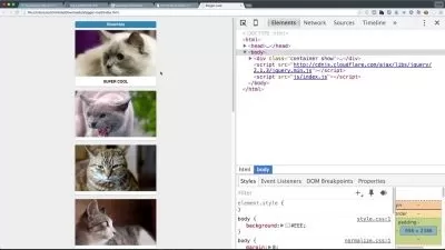
Responsive Images
Focused View
Nick Pettit
46:42
197 View
1-1-Delivering Responsive Images.mp4
03:41
1-2-Image Formats.mp4
04:55
1-3-Srcset with Picturefill.mp4
08:27
1-4-Using Srcset.mp4
10:41
1-5-Adding Sizes.mp4
06:52
2-1-What is Art Direction.mp4
02:42
2-2-The Picture Element.mp4
09:24
Description
About this Course
Using the new source-set and sizes attributes, and the new picture element, it's possible to create images that behave better in a responsive design. These new pieces of markup allow us to deliver the right image to the right device, based on resolution, pixel density, and other factors we define. This will help web pages load faster and look better, and the most capable devices will get the best looking images possible.
What you'll learn
- Image formats
- srcset attribute
- sizes attribute
element - Art direction
More details
User Reviews
Rating
average 0
Focused display
Category

Nick Pettit
Instructor's CoursesNick is a teacher at Treehouse and an independent game developer. His Twitter handle is @nickrp.

Treehouse
View courses TreehouseTreehouse or is an online technology school that offers beginner to advanced courses in web design, web development, mobile development and game development. Its courses are aimed at beginners looking to learn computer coding skills for a career in the tech industry.
- language english
- Training sessions 7
- duration 46:42
- English subtitles has
- Release Date 2023/04/13