Graphics in R: Data Visualization and Data Analysis with R
Nkosingimele Ngcobo || hi-mathstats
13:14:55
Description
Advance your data visualization skills using r packages. Master ggplot2, lattice, interactive plots with ggvis package
What You'll Learn?
- Visualize real world datasets in the professional industries such as finance, health, insurance, marketing, sales
- How to visualize data with ggplot2 package
- Statistical Data visualizations with qplot function
- Statistical Data visualizations with ggplot function
- Master themes in R using ggplot2 package
- Master Faceting with facet_wrap() and facet_grid()
- Master scaling and guides R using scaling functions from ggplot2 package
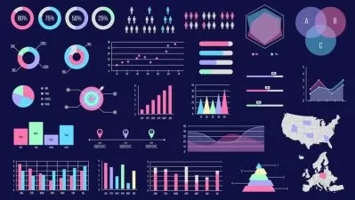
- Use plot function in R to create histograms, box and whisker plots, scatterplots, pie charts, barplots
- Intermediate Data Visualization with the lattice package
- How to use lattice package to create grouped scatterplots, barcharts
- Master panel functions and high level functions in lattice package
- How to switch between Graphics devices in R
- Learn how to use ggvis package
- How to create interactive plots with ggvis package from shiny
- Create interactive scatterplots, histograms, boxplots with input slider from ggvis package
- Data Analysis with dplyr package
- Data Analysis with tidyr package
- Data Analysis with reshape package
- Factors in R and regular expressions
- Master 3D Scatterplots in R
- Use ggplot2 to visualize real world datasets
- Use lattice package to visualize real world datasets
- Create interactive plots from real world datasets with ggvis package
Who is this for?
More details
DescriptionLearn data visualizations by projects that use real world datasets in the professional industries such as finance, marketing, sales etc.
This course will help you master data visualizations techniques and create graphics in R using packages such as ggplot2, lattice package and ggvis package from shiny for adding interactivity into you R graphics.
Real world datasets are used for projects. So, not only will you master the graphics in r, you will also be able to interpret your graphics and make an impressive plots. All done by yourself.
Why learn data visualization with R?
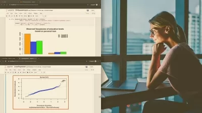
Data Visualization helps people see, interact with, and better understand the data. Whether simple or complex, the right visualization can bring everyone on the same page, regardless of their level of expertise.
Almost all the professional industries benefit from making data more understandable. Every STEM field benefits from data analysts that are able to understand data—and so do fields in government, finance, marketing, history, consumer goods, service industries, education, sports, and so on.
As the “age of Big Data†and "Artificial Intelligence (AI)" kicks into high gear, visualization is an increasingly key tool to make sense of the trillions of rows of data generated every day. Data visualization helps to tell stories by curating data into a form easier to understand, highlighting the trends and outliers. A good visualization tells a story, removing the noise from data and highlighting useful information.
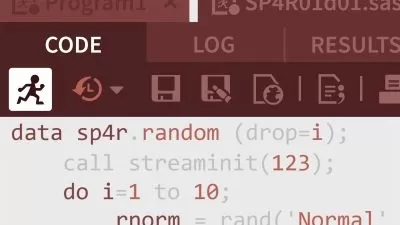
With R tools such as ggplot2 , lattice package, we can create visually appealing graphics and data visualizations by writing few lines of code. For this purpose R is widely used and it is easy to use and understand when it comes to data visualizations, good appealing graphics, data analysis (dplyr) etc. Through R, we can easily customize our data visualization by changing axes, fonts, legends, annotations, and labels.
In this data visualization course you will learn the following:
R for beginners: Vectors, Matrices, Arrays, Data frames and Lists
Factors in R: Create factors, understand factor levels
regular expressions in r: grep and gsub functions
reshape package for data analysis: melt and casting functions
tidyr package for data analysis: gather and spread functions
dplyr package for data analysis: merge functions, filter, select, sort, arrange, pipe operator etc
After Mastering R Programming for beginners and Data Analysis, you will begin creating graphics with r and visualizations. Here is the summary overview of what you will learn:
Graphics in R: Beginner Level
Graphic Devices & Colors
The Plot Function
Low Level Functions
Data Visualization in R: Beginner Level
Barplots & Pie Charts
Histograms in r
Box and Whisker Plots
Scatterplots
Intermediate Data Visualization & Graphics in R
What is ggplot2?
qplot() function
ggplot() function
Data Visualization with Lattice Package
Lattice Graphics
High Level Functions in lattice package
Lattice Package panel functions
Going further with data visualization
How to Handle and switch between graphics
Controlling layout with layout function
ggplot2 scales and guides:
scale_x_continous, scale_y_continous, scale_color_manual,scale_fill_manual
scale_shape_manual,scale_shape_manual,scale_alpha_continous
guide_legend, gudei_colorbar
ggplot2 faceting: facet_wrap() vs facet_grid()
ggplot2 themes
ggvis package:
scatterplot with layers, interactive plots with input_slider(), add_legend(), add_axis etc
After completing the course you will receive the electronic certificate that you can add on your resume or CV and LinkedIn profile from Udemy.
The access to this course is also lifetime, hence you will learn at your own pace. The course is also updated regularly to ensure it meets all the students demands and students enrolled are learning latest version of r and r studio
I am certain with all the material covered in this course you will be able to advance you Data visualization and Data Analysis skills!
See you in the first lecture!
Who this course is for:
- Beginners in R programmers who are not in a rush to master everything at once
- Beginner R programmers who want to learn data visualization
- Absolute beginners in Programming
- University or college students wanting to learn data visualizations using R
- Post graduates students who are keen on using R for exploration and data analysis
Learn data visualizations by projects that use real world datasets in the professional industries such as finance, marketing, sales etc.
This course will help you master data visualizations techniques and create graphics in R using packages such as ggplot2, lattice package and ggvis package from shiny for adding interactivity into you R graphics.
Real world datasets are used for projects. So, not only will you master the graphics in r, you will also be able to interpret your graphics and make an impressive plots. All done by yourself.
Why learn data visualization with R?
Data Visualization helps people see, interact with, and better understand the data. Whether simple or complex, the right visualization can bring everyone on the same page, regardless of their level of expertise.
Almost all the professional industries benefit from making data more understandable. Every STEM field benefits from data analysts that are able to understand data—and so do fields in government, finance, marketing, history, consumer goods, service industries, education, sports, and so on.
As the “age of Big Data†and "Artificial Intelligence (AI)" kicks into high gear, visualization is an increasingly key tool to make sense of the trillions of rows of data generated every day. Data visualization helps to tell stories by curating data into a form easier to understand, highlighting the trends and outliers. A good visualization tells a story, removing the noise from data and highlighting useful information.
With R tools such as ggplot2 , lattice package, we can create visually appealing graphics and data visualizations by writing few lines of code. For this purpose R is widely used and it is easy to use and understand when it comes to data visualizations, good appealing graphics, data analysis (dplyr) etc. Through R, we can easily customize our data visualization by changing axes, fonts, legends, annotations, and labels.
In this data visualization course you will learn the following:
R for beginners: Vectors, Matrices, Arrays, Data frames and Lists
Factors in R: Create factors, understand factor levels
regular expressions in r: grep and gsub functions
reshape package for data analysis: melt and casting functions
tidyr package for data analysis: gather and spread functions
dplyr package for data analysis: merge functions, filter, select, sort, arrange, pipe operator etc
After Mastering R Programming for beginners and Data Analysis, you will begin creating graphics with r and visualizations. Here is the summary overview of what you will learn:
Graphics in R: Beginner Level
Graphic Devices & Colors
The Plot Function
Low Level Functions
Data Visualization in R: Beginner Level
Barplots & Pie Charts
Histograms in r
Box and Whisker Plots
Scatterplots
Intermediate Data Visualization & Graphics in R
What is ggplot2?
qplot() function
ggplot() function
Data Visualization with Lattice Package
Lattice Graphics
High Level Functions in lattice package
Lattice Package panel functions
Going further with data visualization
How to Handle and switch between graphics
Controlling layout with layout function
ggplot2 scales and guides:
scale_x_continous, scale_y_continous, scale_color_manual,scale_fill_manual
scale_shape_manual,scale_shape_manual,scale_alpha_continous
guide_legend, gudei_colorbar
ggplot2 faceting: facet_wrap() vs facet_grid()
ggplot2 themes
ggvis package:
scatterplot with layers, interactive plots with input_slider(), add_legend(), add_axis etc
After completing the course you will receive the electronic certificate that you can add on your resume or CV and LinkedIn profile from Udemy.
The access to this course is also lifetime, hence you will learn at your own pace. The course is also updated regularly to ensure it meets all the students demands and students enrolled are learning latest version of r and r studio
I am certain with all the material covered in this course you will be able to advance you Data visualization and Data Analysis skills!
See you in the first lecture!
Who this course is for:
- Beginners in R programmers who are not in a rush to master everything at once
- Beginner R programmers who want to learn data visualization
- Absolute beginners in Programming
- University or college students wanting to learn data visualizations using R
- Post graduates students who are keen on using R for exploration and data analysis
User Reviews
Rating

Nkosingimele Ngcobo || hi-mathstats
Instructor's Courses
Udemy
View courses Udemy- language english
- Training sessions 157
- duration 13:14:55
- Release Date 2023/04/10