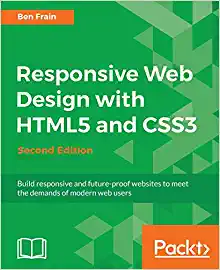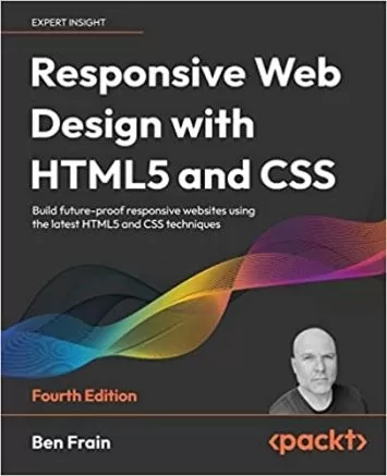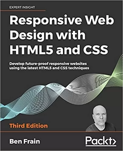
Responsive Web Design with HTML5 and CSS: Develop future-proof responsive websites using the latest HTML5 and CSS techniques, 3rd Edition
Category
Author
Publication
Packt Publishing
Responsive Web Design with HTML5 and CSS, Third Edition is a renewed and extended version of one of the most comprehensive and bestselling books on the latest HTML5 and CSS tools and techniques for responsive web design.
Written in the author's signature friendly and informal style, this edition covers all the newest developments and improvements in responsive web design including better user accessibility, variable fonts and font loading, CSS Scroll Snap, and much, much more. With a new chapter dedicated to CSS Grid, you will understand how it differs from the Flexbox layout mechanism and when you should use one over the other.
Furthermore, you will acquire practical knowledge of SVG, writing accessible HTML markup, creating stunning aesthetics and effects with CSS, applying transitions, transformations, and animations, integrating media queries, and more. The book concludes by exploring some exclusive tips and approaches for front-end development from the author.
By the end of this book, you will not only have a comprehensive understanding of responsive web design and what is possible with the latest HTML5 and CSS, but also the knowledge of how to best implement each technique.
About the Author
Ben Frain has been a web designer/developer since 1996. He is currently employed as a UI-UX Technical Lead at bet365. Before the web, he worked as an underrated (and modest) TV actor and technology journalist, having graduated from Salford University with a degree in Media and Performance. He has written four equally underrated (his opinion) screenplays and still harbors the (fading) belief he might sell one. Outside of work, he enjoys simple pleasures: playing indoor football while his body and wife still allow it, and wrestling with his two sons.
- Integrate CSS media queries into your designs; apply different styles to different devices
- Load different sets of images depending upon screen size or resolution
- Leverage the speed, semantics, and clean markup of accessible HTML patterns
- Implement SVGs into your designs to provide resolution-independent images
- Apply the latest features of CSS like custom properties, variable fonts, and CSS Grid
- Add validation and interface elements like date and color pickers to HTML forms
- Understand the multitude of ways to enhance interface elements with filters, shadows, animations, and more
Are you a full-stack developer who needs to gem up on their front-end skills? Perhaps you work on the front-end and you need a definitive overview of all modern HTML and CSS has to offer? Maybe you have done a little website building but you need a deep understanding of responsive web designs and how to achieve them? This is a book for you!
All you need to take advantage of this book is a working understanding of HTML and CSS. No JavaScript knowledge is needed.
- The Essentials of Responsive Web Design
- Writing HTML Markup
- Media Queries Supporting Differing Viewports
- Fluid Layout, Flexbox, and Responsive Images
- Layout with CSS Grid
- CSS Selectors, Typography, Color Modes, and More
- Stunning Aesthetics with CSS
- Using SVGs for Resolution Independence
- Transitions, Transformations, and Animations
- Conquer Forms with HTML5 and CSS
- Bonus Techniques and Parting Advice


