Dashboard Design Fundamentals [2022] - Dashboards that work
Joshua Brindley
4:49:39
Description
Learn Data Science & Data Analytics Dashboard Design for any tool inc. Microsoft Power BI, Python, Excel, Tableau
What You'll Learn?
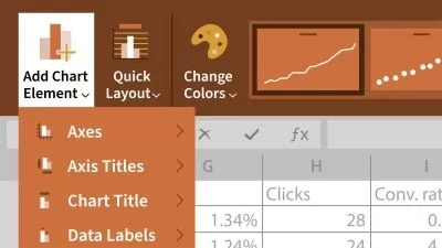
- Design Effective Dashbords
- Turn data from Excel, Microsoft Power BI, Tableau, Python and R into interactive dashboards
- Data Storytelling and Data Visualization for dashboards
- Take insights from data analytics and data science and turn them into effective dashboards
Who is this for?
More details
DescriptionThe most updated and complete Storytelling with Data and Data Visualization for dashboard design course on Udemy! You'll learn the skills that lead to effective dashboards that drive action through interactive dashboards: from communicating with data, to creating impactful data visualizations, to user experience and design principles, that will lead to effective dashboards that leave a lasting impression on an audience and get results.
We will be exploring and learning:
Tactical dashboards
Operational dashboards
Strategic dashboards
KPI dashboards
Sandbox dashboards
Analytical dashboards
Finance dashboards
Management dashboard
HR dashboards
The course is for any tool including Microsoft Power BI, Python, Excel, Tableau, and is applicable to data analysts, business professionals, data scientists and business intelligence professionals. Right now in 2021, there is a huge shortage of people who can effectively communicate with data - recruiters and businesses the world over are seeking professionals who can turn data into a meaningful story. The demand for talented professionals who can compel and audience with a well crated and engaging story from data is increasing at an insane rate. More and more companies are finally figuring out how important it is to be able to converse with data and the role it plays to their success.
Students aren't required to know anything beforehand - I'll teach you the fundamentals, how to apply them, how to develop into an advanced dashboard designer.
Who this course is for:
Anyone who has an audience who would benefit from insightful data communications
Anyone wanting to learn how to tell stories with data dashboards
Anyone who wants to create impactful Data Visualizations
Already established Data Scientists who want to advance their skillset
Who this course is for:
- Anyone in business who wants to create effective dashboards
- IT professionals who want to communicate with data
- Beginner to Advance Data Scientists and Data Analysts who want to create interactive dashboards
- Excel, Microsoft Power BI, Tableau, Python and R users of all levels who need to visualize their insights
The most updated and complete Storytelling with Data and Data Visualization for dashboard design course on Udemy! You'll learn the skills that lead to effective dashboards that drive action through interactive dashboards: from communicating with data, to creating impactful data visualizations, to user experience and design principles, that will lead to effective dashboards that leave a lasting impression on an audience and get results.
We will be exploring and learning:
Tactical dashboards
Operational dashboards
Strategic dashboards
KPI dashboards
Sandbox dashboards
Analytical dashboards
Finance dashboards
Management dashboard
HR dashboards
The course is for any tool including Microsoft Power BI, Python, Excel, Tableau, and is applicable to data analysts, business professionals, data scientists and business intelligence professionals. Right now in 2021, there is a huge shortage of people who can effectively communicate with data - recruiters and businesses the world over are seeking professionals who can turn data into a meaningful story. The demand for talented professionals who can compel and audience with a well crated and engaging story from data is increasing at an insane rate. More and more companies are finally figuring out how important it is to be able to converse with data and the role it plays to their success.
Students aren't required to know anything beforehand - I'll teach you the fundamentals, how to apply them, how to develop into an advanced dashboard designer.
Who this course is for:
Anyone who has an audience who would benefit from insightful data communications
Anyone wanting to learn how to tell stories with data dashboards
Anyone who wants to create impactful Data Visualizations
Already established Data Scientists who want to advance their skillset
Who this course is for:
- Anyone in business who wants to create effective dashboards
- IT professionals who want to communicate with data
- Beginner to Advance Data Scientists and Data Analysts who want to create interactive dashboards
- Excel, Microsoft Power BI, Tableau, Python and R users of all levels who need to visualize their insights
User Reviews
Rating

Joshua Brindley
Instructor's Courses
Udemy
View courses Udemy- language english
- Training sessions 33
- duration 4:49:39
- Release Date 2022/12/06