Companies Home Search Profile

Complete Guide to Tableau for Data Scientists

Focused View

Matt Francis

10:29:41

0 View
  • 01 - The power of Tableau for data scientists.mp4
    00:38
  • 02 - What you should know.mp4
    03:44
  • 03 - Tableau UI tour.mp4
    06:30
  • 04 - Tableau order of operations.mp4
    04:29
  • 05 - Welcome to the Langdon Hotel.mp4
    03:12
  • 01 - Understand the difference between green and blue fields.mp4
    06:37
  • 02 - How do green and blue fields affect rows and columns.mp4
    05:59
  • 03 - How do green and blue fields affect filters.mp4
    05:29
  • 04 - How do green and blue fields affect colors.mp4
    06:33
  • 05 - How do green and blue fields affect dates.mp4
    06:25
  • 06 - Challenge Green and blue.mp4
    00:46
  • 07 - Solution Green and blue.mp4
    03:20
  • 01 - How to connect to Excel sheets.mp4
    05:17
  • 02 - How to clean Excel data with the Data Interpreter.mp4
    04:17
  • 03 - How to connect to Google Sheets.mp4
    06:01
  • 04 - How to connect to PDF files and extract tables of data.mp4
    06:26
  • 05 - Setting up the default properties of your data source.mp4
    05:27
  • 06 - Saving your data sources for future use.mp4
    04:46
  • 07 - Challenge Creating a data source.mp4
    01:18
  • 08 - Solution Creating a data source.mp4
    06:42
  • 01 - Combining data using relationships.mp4
    04:02
  • 02 - What are the different ways of joining data.mp4
    06:58
  • 03 - How to join tables in the same data connection.mp4
    06:39
  • 04 - How to join tables in two using a cross database join.mp4
    05:22
  • 05 - How to append one data source to another using unions.mp4
    06:51
  • 06 - Challenge Combining data, part 1.mp4
    00:57
  • 07 - Solution Combining data, part 1.mp4
    09:21
  • 08 - Challenge Combining data, part 2.mp4
    00:42
  • 09 - Solution Combining data, part 2.mp4
    07:35
  • 01 - What are the pros and cons of using a data extract.mp4
    05:50
  • 02 - How to create a data extract..mp4
    04:14
  • 03 - How to limit the data in a data extract.mp4
    06:53
  • 04 - How to edit a data extract to include more data.mp4
    07:03
  • 01 - What are measure names and measure values.mp4
    05:26
  • 02 - Creating a combined axis chart.mp4
    06:41
  • 03 - Creating a dual axis chart.mp4
    07:11
  • 04 - Creating a bar-in-bar chart.mp4
    06:23
  • 05 - Creating a multiple measure crosstab.mp4
    03:53
  • 06 - Comparing two measures using a scatter plot.mp4
    04:30
  • 07 - Challenge Comparing measures, part 1.mp4
    01:00
  • 08 - Solution Comparing measures, part 1.mp4
    09:12
  • 09 - Challenge Comparing measures, part 2.mp4
    00:59
  • 10 - Solution Comparing measures, part 2.mp4
    06:16
  • 01 - How do calculations work in Tableau.mp4
    07:35
  • 02 - Understanding the order of operations in calculation.mp4
    06:39
  • 03 - Manipulating strings using string functions.mp4
    08:14
  • 04 - Manipulating dates with date functions.mp4
    07:55
  • 05 - Creating logic calculations using IF functions.mp4
    06:29
  • 06 - How do table calculations work.mp4
    08:13
  • 07 - Table calc directions.mp4
    06:41
  • 08 - What are Level of Detail (LOD) calculations.mp4
    03:54
  • 09 - EXCLUDE LOD calculations.mp4
    05:06
  • 10 - INCLUDE LOD calculations.mp4
    03:56
  • 11 - FIXED LOD calculations.mp4
    04:31
  • 12 - Using calculations in a join.mp4
    07:01
  • 13 - Challenge Calculations.mp4
    01:21
  • 14 - Solution Calculations.mp4
    06:00
  • 01 - Just because you can, should you create a map.mp4
    07:45
  • 02 - How to create an area map.mp4
    06:54
  • 03 - How to create a symbol map.mp4
    07:03
  • 04 - Customizing the look of your maps.mp4
    07:37
  • 05 - Create locations from coordinates.mp4
    06:26
  • 06 - Create lines to connect locations on a map.mp4
    07:11
  • 07 - Analyzing distances using buffer calculations.mp4
    05:35
  • 08 - Analyzing spatial data using intersect calculations.mp4
    07:39
  • 09 - Challenge Mapping.mp4
    01:01
  • 10 - Solution Mapping.mp4
    07:46
  • 01 - What is the Analytics pane.mp4
    04:49
  • 02 - Create a constant reference line.mp4
    05:02
  • 03 - Create a dynamic average reference line.mp4
    07:08
  • 04 - How to create box plots.mp4
    05:18
  • 05 - Adding totals and sub-totals to a view.mp4
    06:55
  • 06 - Adding a forecast to a view.mp4
    04:34
  • 07 - Adding a trend line to a view.mp4
    05:53
  • 08 - Looking for clusters of data in a view.mp4
    05:10
  • 09 - Creating a reference band.mp4
    07:22
  • 10 - Challenge Analytics, part 1.mp4
    01:21
  • 11 - Solution Analytics, part 1.mp4
    06:25
  • 12 - Challenge Analytics, part 2.mp4
    01:11
  • 13 - Solution Analytics, part 2.mp4
    06:49
  • 01 - How are parameters different compared to filters.mp4
    07:18
  • 02 - How to use parameters in a calculation.mp4
    06:51
  • 03 - Create dynamic reference lines using parameters.mp4
    07:25
  • 04 - Use a parameter to select dimensions and measures.mp4
    08:10
  • 05 - Use a parameter to search free text fields.mp4
    05:58
  • 06 - Top N analysis.mp4
    05:38
  • 07 - Dynamic parameters.mp4
    07:18
  • 08 - Challenge Parameters.mp4
    01:25
  • 09 - Solution Parameters.mp4
    08:19
  • 01 - Introducing the dashboard UI.mp4
    06:40
  • 02 - How to create a tiled dashboard.mp4
    07:51
  • 03 - How to create a floating dashboard.mp4
    04:51
  • 04 - How to use filter actions.mp4
    06:19
  • 05 - How to use highlight actions.mp4
    06:37
  • 06 - How to use URL actions.mp4
    03:48
  • 07 - Navigating between dashboards using go to sheet actions.mp4
    06:20
  • 08 - How to use set actions.mp4
    06:03
  • 09 - A deeper look at containers.mp4
    04:38
  • 10 - Challenge Dashboards.mp4
    00:54
  • 11 - Solution Dashboards.mp4
    09:07
  • 12 - Solution Dashboards, continued.mp4
    09:02
  • 01 - How to create bar charts.mp4
    01:00
  • 02 - How to use colors to highlight data.mp4
    03:35
  • 03 - How to create timelines.mp4
    02:15
  • 04 - How to create small multiple timelines.mp4
    02:51
  • 05 - How to create month-over-month or year-over-year charts.mp4
    03:13
  • 06 - How to create a combined axis bar chart.mp4
    01:57
  • 07 - How to create a combined axis timeline.mp4
    01:45
  • 08 - How to create a dual axis timeline.mp4
    02:45
  • 09 - Two ways to create a crosstab.mp4
    02:06
  • 10 - Enhance a crosstab using colors to create a highlight table.mp4
    02:03
  • 11 - How to turn a crosstab into a heatmap.mp4
    02:33
  • 12 - How to create an area chart.mp4
    01:28
  • 13 - Whats the difference between line charts vs. area charts.mp4
    03:52
  • 14 - How to create 100% area charts.mp4
    02:32
  • 15 - How to create stacked bar charts.mp4
    01:06
  • 16 - How to create a 100% stacked bar chart.mp4
    01:46
  • 17 - How and why to add a running total to a line chart.mp4
    02:35
  • 18 - How to show the difference between values in a line chart.mp4
    01:48
  • 19 - How to create a scatter plot and a bubble chart.mp4
    02:22
  • 20 - How to create a connected scatterplot to show changes over time.mp4
    03:07
  • 21 - How to create a bar-in-bar chart and a candlestick chart.mp4
    03:14
  • 22 - How to create a symbol map.mp4
    01:56
  • 23 - How to create a filled area map.mp4
    02:03
  • 24 - How to create pie charts.mp4
    02:08
  • 25 - How to create Gantt charts.mp4
    04:19
  • 01 - How can I grow my data science and Tableau skills.mp4
    04:27
  • Description


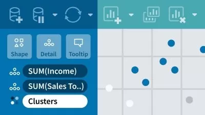
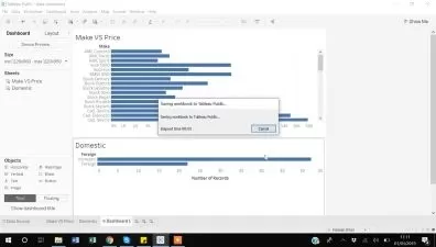
    If your work requires any sort of graphical visualization of data, chances are you’ve run into Tableau. If you’ve been using Tableau but want to learn how to really harness its full power for data science, join expert Matt Francis in this course as he shows you how to take your skills to the next level. Matt starts with one of the most important features in Tableau: the difference between the green and blue pills (discrete and continuous data) and how this affects every single action Tableau performs. He then shows how to connect to and combine data from different data sources, how to create different charts to make sense of data, ways to transform your data with calculations, and how to create interactive maps. Finally, Matt details ways to present data effectively and how to make engaging dashboards. Whether you want to learn more about Tableau as a whole, or if you just want to improve your knowledge of a single subject, this course will help up your Tableau game.

    More details


    User Reviews
    Rating
    0
    0
    0
    0
    0
    average 0
    Total votes0
    Focused display
    Category
    Matt Francis
    Matt Francis
    Instructor's Courses
    LinkedIn Learning is an American online learning provider. It provides video courses taught by industry experts in software, creative, and business skills. It is a subsidiary of LinkedIn. All the courses on LinkedIn fall into four categories: Business, Creative, Technology and Certifications. It was founded in 1995 by Lynda Weinman as Lynda.com before being acquired by LinkedIn in 2015. Microsoft acquired LinkedIn in December 2016.
    • language english
    • Training sessions 127
    • duration 10:29:41
    • English subtitles has
    • Release Date 2025/01/16