Companies Home Search Profile

[3-in-1] Data Viz Bundle: Tableau, Excel & Looker Studio

Focused View

Start-Tech Academy

17:41:39

108 View
  • 1. Introduction.mp4
    03:38
  • 2. Course Resources.html
  • 3. Why Tableau.mp4
    04:28
  • 4. This is a milestone!.mp4
    03:31
  • 5. Tableau Products.mp4
    09:21
  • 1. Installing Tableau desktop and Public.mp4
    05:02
  • 2. About the data.mp4
    09:59
  • 3. Connecting to data.mp4
    12:26
  • 4. Live vs Extract.mp4
    04:24
  • 1. Combining data from multiple tables.mp4
    04:27
  • 2. Relationships in Tableau.mp4
    13:56
  • 3. Joins in Tableau.mp4
    06:43
  • 4. Types of Joins in Tableau.mp4
    06:12
  • 5. Union in Tableau.mp4
    07:55
  • 6. Physical Logical layer and Data models.mp4
    06:30
  • 7. The visualization screen - Sheet.mp4
    09:13
  • 1. Types of Data - Dimensions and Measures.mp4
    06:49
  • 2. Types of Data - Discreet and Continuous.mp4
    06:09
  • 3. Changing Data type in Tableau.mp4
    09:25
  • 1. Bar charts.mp4
    14:09
  • 2. Line charts.mp4
    08:53
  • 3. Scatterplots.mp4
    06:11
  • 1. Marks cards.mp4
    13:38
  • 2. Dropping Dimensions and Measures on marks card.mp4
    09:49
  • 3. Dropping Dimensions on Line chart.mp4
    04:10
  • 4. Adding marks in scatterplot.mp4
    04:44
  • 1. Text tables, heat map and highlight tables.mp4
    08:33
  • 2. Pie charts.mp4
    07:34
  • 3. Area charts.mp4
    09:06
  • 4. Creating custom hierarchy.mp4
    04:04
  • 5. Tree map.mp4
    05:00
  • 6. Dual combination charts.mp4
    08:16
  • 7. Creating Bins.mp4
    06:11
  • 8. Histogram.mp4
    04:36
  • 1. Grouping Data.mp4
    09:18
  • 2. Filtering data.mp4
    09:31
  • 3. Dimension filters.mp4
    10:55
  • 4. Measure filters.mp4
    04:04
  • 5. Date-Time filters.mp4
    08:02
  • 6. Filter options.mp4
    08:51
  • 7. Types of filters and order of operation.mp4
    11:00
  • 8. Customizing visual filters.mp4
    09:09
  • 9. Sorting options.mp4
    14:35
  • 1. How to make a map chart.mp4
    07:04
  • 2. Considerations before making a Map chart.mp4
    04:46
  • 3. Marks card for customizing maps.mp4
    07:26
  • 4. Customizing maps using map menu.mp4
    09:33
  • 5. Layers in a Map.mp4
    07:56
  • 6. Visual toolbar on a map.mp4
    04:35
  • 7. Custom background images.mp4
    11:04
  • 8. Territories in maps.mp4
    06:12
  • 9. Data blending for missing geocoding.mp4
    11:09
  • 1. Calculated fields in Tableau.mp4
    15:07
  • 2. Functions in Tableau.mp4
    02:53
  • 3. Table calculations theory.mp4
    07:06
  • 4. Table calculations in Tableau.mp4
    09:38
  • 5. Understanding LOD expressions.mp4
    27:11
  • 6. LOD expressions examples.mp4
    15:49
  • 7. Analytics pane.mp4
    20:01
  • 1. Understanding sets in Tableau.mp4
    05:34
  • 2. Creating Sets in Tableau.mp4
    10:51
  • 3. Parameters.mp4
    14:45
  • 1. Dashboard part -1.mp4
    17:04
  • 2. Dashboard part - 2.mp4
    10:45
  • 3. Story.mp4
    05:09
  • 1. Connecting to SQL data source.mp4
    05:26
  • 2. Connecting to cloud storage services.mp4
    03:53
  • 1.1 01 Why charts.pdf
  • 1. Why are charts used.mp4
    02:11
  • 1.1 02 Conveying+Message.pdf
  • 1. Excel Charts - Categories of messages that can be conveyed.mp4
    04:34
  • 2.1 03 Chart Elements.pdf
  • 2. Elements of charts.mp4
    05:23
  • 3.1 04 oneclick.xlsx
  • 3. The easy way of creating charts.mp4
    03:17
  • 1.1 05 Column Charts.xlsx
  • 1. Bar and column charts.mp4
    12:38
  • 2.1 06 formatting.xlsx
  • 2. Formatting charts - Part - 1.mp4
    10:14
  • 3. Formatting charts - Part 2.mp4
    04:58
  • 4.1 05 bar+chart adv.pdf
  • 4. Best Practices Bar chart.mp4
    10:06
  • 5.1 07 Line charts.xlsx
  • 5. Line Charts.mp4
    09:04
  • 6.1 10 Avoiding+Spaghetti+plot.pdf
  • 6. Avoiding the Spaghetti plot.mp4
    05:27
  • 7.1 07 Area charts.xlsx
  • 7. Area Charts.mp4
    05:51
  • 8.1 09 Pie charts.xlsx
  • 8. Pie and Doughnut Charts.mp4
    12:58
  • 9.1 06 pie.pdf
  • 9. Why we should avoid Pie charts.mp4
    04:05
  • 10.1 09 Scatter charts.xlsx
  • 10. Scatter plot or XY chart.mp4
    16:17
  • 11. Frequency Distribution and Histograms.mp4
    13:03
  • 12. Waterfall Charts.mp4
    12:00
  • 13.1 18 combine charts.xlsx
  • 13. Combination charts.mp4
    07:32
  • 14.1 08 Highlighting+message.pdf
  • 14. Highlighting chart message.mp4
    03:25
  • 15.1 11 Eliminating distraction+.pdf
  • 15. Eliminating Distractions from the Graph.mp4
    06:54
  • 16.1 08 Avoiding+Clutter.pdf
  • 16. Avoiding clutter.mp4
    05:35
  • 1. Pivot table.mp4
    08:53
  • 2. Pivot Charts.mp4
    05:05
  • 1.1 10 Stock.xlsx
  • 1. Stock charts.mp4
    11:28
  • 2.1 12 Radar.xlsx
  • 2. Radar charts.mp4
    04:51
  • 3.1 13 Surface.xlsx
  • 3. Surface charts.mp4
    05:14
  • 4.1 16 heatmap.xlsx
  • 4. Heatmaps.mp4
    04:55
  • 1.1 19 sparklines.xlsx
  • 1. Mini charts Sparklines.mp4
    05:43
  • 1.1 Lecture 15 Infographics.xlsx
  • 1. Creative Infographic 1.mp4
    14:12
  • 2.1 Lecture 16 Infographics.xlsx
  • 2. Creative Infographic 2.mp4
    06:51
  • 1.1 Lecture Maps Solved.xlsx
  • 1.2 Lecture Maps Unsolved.xlsx
  • 1. Maps chart.mp4
    10:00
  • 1. Why Data Studio.mp4
    09:53
  • 1. Data Studio Home Screen And Dataset vs Data Source.mp4
    06:12
  • 2. Structure of Input data.mp4
    01:05
  • 3. Dimensions vs Measures (new definition).mp4
    05:42
  • 1. Opening Data Studio and preparing data.mp4
    09:08
  • 2. Adding data source.mp4
    06:15
  • 3. Managing added data source.mp4
    11:36
  • 1. Data Table.mp4
    10:08
  • 2. Styling tab for data table.mp4
    14:00
  • 3. Scorecards.mp4
    07:51
  • 1. Simple Bar and Column chart.mp4
    07:39
  • 2. Stacked Column chart.mp4
    05:22
  • 1. GeoMap.mp4
    03:23
  • 1. Time Series.mp4
    08:08
  • 2. Update to Time Series chart.mp4
    05:23
  • 3. Line Chart and Combo Chart.mp4
    04:50
  • 1. Pie Chart and Donut Chart.mp4
    05:46
  • 2. Stacked Area Charts.mp4
    07:28
  • 3.1 Areachart updated (1).csv
  • 3. Updated data file for area chart.html
  • 1. Scatter Plots and Bubble charts.mp4
    10:27
  • 1. Pivot tables for cross tabulation.mp4
    06:34
  • 1. Bullet Chart.mp4
    04:11
  • 1. TreeMaps.mp4
    04:47
  • 1. Branding a Report Brand Logo and Company Details.mp4
    05:31
  • 2. Brand colors for report branding.mp4
    04:39
  • 1. Filter controls for viewers.mp4
    09:05
  • 1. URL Embed to include external content.mp4
    05:08
  • 1. Blending data from multiple tables.mp4
    09:41
  • 2. Different types of Joins while blending data.mp4
    12:18
  • 1. Downloading report as PDF and Page Management.mp4
    03:17
  • 2. Sharing report and Data Credentials.mp4
    10:05
  • 3. Sharing report using a link.mp4
    02:46
  • 4. Scheduling emails.mp4
    03:42
  • 5. Embeding report on Website.mp4
    02:36
  • 1. Connecting and Visualizing Data in Google BigQuery.mp4
    10:01
  • 1. Highlighting chart message.mp4
    03:25
  • 2. Eliminating Distractions from the Graph.mp4
    06:54
  • 3. Avoiding clutter.mp4
    05:35
  • 4. Avoiding the Spaghetti plot.mp4
    05:27
  • 5. The final milestone!.mp4
    01:33
  • 1. Bonus Lecture.html
  • Description


    Learn and compare the three most used data visualization tools in one course- Tableau, Microsoft Excel & Google's Looker

    What You'll Learn?


    • Develop proficiency in using Tableau, Excel and Looker Studio for creating effective data visualizations.
    • Learn how to connect and integrate data from various sources for data analysis and visualization.
    • Explore the differences between Tableau, Excel and Looker in terms of functionality, features and use cases.
    • Understand how to combine data sources and use joins and blends in Tableau, Excel and Looker.
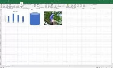
    • Explore how to create and customize charts, graphs and maps in Tableau, Excel and Looker.
    • Develop an understanding of how to share and publish dashboards and visualizations in Tableau, Excel and Looker.
    • Discover best practices for data visualization and storytelling in Tableau, Excel and Looker.

    Who is this for?


  • Students or beginners who are new to the field of data visualization and want to learn about the top tools in the market.
  • Business professionals who want to gain advanced skills in data visualization using the three most popular tools.
  • Analysts or managers who work with large sets of data and need to present them in an easy-to-understand manner to others.
  • Data enthusiasts who want to broaden their knowledge in data visualization and learn about the latest features in these tools.
  • What You Need to Know?


  • A PC with internet connection. Installation instructions for the tools used are covered in the course.
  • More details


    Description

    Are you ready to unlock the power of data visualization and take your data analytics to the next level? If so, then our course, "[3-in-1] Data Viz Bundle: Tableau, Excel & Google's Looker Studio," is perfect for you!

    In this course, you will explore and compare the three most popular data visualization tools- Tableau, Microsoft Excel & Google's Looker Studio. By the end of this course, you will have mastered the art of data visualization using these powerful tools, and will be able to develop dynamic and effective visualizations for your business or personal use.

    Here are some of the key values this course will bring:

    • Develop proficiency in Tableau, Excel and Looker Studio for data visualization

    • Master the skills to create interactive dashboards and visualizations

    • Explore and compare different visualization techniques and choose the best tool for your use case

    • Understand how to import, clean, and transform data for visualization

    • Create compelling visualizations to present and communicate data insights

    Data visualization is an essential skill for anyone working with data today. With the amount of data available, the ability to create insightful and visually appealing visualizations can give you a competitive advantage in your career.

    During this course, you will complete various activities, such as hands-on projects and quizzes, to reinforce your learning and get hands-on experience with Tableau, Excel and Google's Looker Studio.

    Our course is unique because it combines the three most popular data visualization tools in one comprehensive course, enabling you to compare and contrast their capabilities and learn which tool is best suited for your use case. Our instructors are industry experts with years of experience in data analysis and visualization, ensuring you get the best possible education.

    So, if you want to take your data analysis skills to the next level, enroll in our "[3-in-1] Data Viz Bundle: Tableau, Excel & Looker Studio" course today and become a data visualization expert!

    Who this course is for:

    • Students or beginners who are new to the field of data visualization and want to learn about the top tools in the market.
    • Business professionals who want to gain advanced skills in data visualization using the three most popular tools.
    • Analysts or managers who work with large sets of data and need to present them in an easy-to-understand manner to others.
    • Data enthusiasts who want to broaden their knowledge in data visualization and learn about the latest features in these tools.

    User Reviews
    Rating
    0
    0
    0
    0
    0
    average 0
    Total votes0
    Focused display
    Start-Tech Academy
    Start-Tech Academy
    Instructor's Courses
    Start-Tech Academy is a technology-based Analytics Education Company and aims at Bringing Together the analytics companies and interested Learners. Our top quality training content along with internships and project opportunities helps students in launching their Analytics journey. Founded by Abhishek Bansal and Pukhraj Parikh. Working as a Project manager in an Analytics consulting firm, Pukhraj has multiple years of experience working on analytics tools and software. He is competent in  MS office suites, Cloud computing, SQL, Tableau, SAS, Google analytics and Python.Abhishek worked as an Acquisition Process owner in a leading telecom company before moving on to learning and teaching technologies like Machine Learning and Artificial Intelligence.
    Students take courses primarily to improve job-related skills.Some courses generate credit toward technical certification. Udemy has made a special effort to attract corporate trainers seeking to create coursework for employees of their company.
    • language english
    • Training sessions 135
    • duration 17:41:39
    • Release Date 2023/06/11

    Courses related to Data Visualization

    Courses related to Excel VBA

    Courses related to Excel

    Courses related to Excel Analytics

    Courses related to Excel Dashboard

    Courses related to Excel Modeling

    Courses related to Excel Formulas and Functions

    Courses related to Excel Macros

    Courses related to Excel Charts

    Courses related to Excel Shortcuts and Tips